联大滋味Logo设计文案 核心概念:
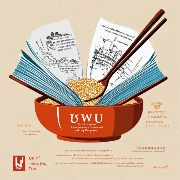
提示词:UN Taste Logo Design Copy Core Concept: With the "spirit of Southwest Associated University" as the soul and "cultural nourishment" as the form, we integrate the historical depth of Southwest Associated University with the warmth and approachability of food brands to create a visual symbol that possesses both cultural heritage and modern aesthetics. Design Element Analysis: Main Graphic — The Symbiosis of Books and Bowls The book transforms into a bowl: abstract lines convert the opened pages of a book into a bowl filled with food, symbolizing the dual concept of "knowledge nourishes the mind, food nourishes the body" from Southwest Associated University. Chopsticks forming the pen barrel: Two chopsticks cross like a fountain pen, with a grain of rice embellishing the pen tip, subtly alluding to the spirit of "using the pen as a gun, using food as sustenance," paying tribute to the resilience of teachers and students who found joy amidst hardship during wartime. Color System: Ochre Red (Primary Color): Derived from the brick wall color of the university's buildings, conveying historical accumulation and resilience; Wheat Gold (Secondary Color): Symbolizing warmth and abundance of food, enhancing appetite associations; Gray-Blue (Background Color): Echoing the simple image of faculty and students in "blue cloth long gowns," balancing the overall texture. Font Design: Chinese uses an improved version of "Old Song Ti," retaining the solemnity of stone inscriptions while softening the corners to align with the approachability of food; The English serif font resonates with the Chinese, with fine line gear patterns embedded between the letters "SWU," metaphorically referring to the contribution of the university's engineering school to wartime food production. Detail Easter Eggs: A very thin "Triple School Union Line" is hidden along the edge of the bowl: it is abstractly connected by iconic lines from the emblems of Peking University, Tsinghua University, and Nankai University, needing to be magnified for visibility; Negative space forms the outline of the Kunming map, with the location of Dianchi marked by a chili pepper, subtly hinting at regional characteristics. Brand Association Words: War Flames · Food Security · Cultural Continuity — A taste that transcends time and space, revealing the sweetness of knowledge through each bite. (The copy can be simplified for application scenarios into a combination of graphics + the standard text "UN Taste" to ensure recognition at small sizes.) --ar 1:1 --v 6.1 --stylize 100
素材来源:Midjourney官网
Copyright©2017 Midjourney9.com All Right
Reserved 版权所有:成都金翼云科技有限公司 蜀ICP备2023008999号